Книга: Mastering VMware® Infrastructure3
Performance Graphs
Разделы на этой странице:
Performance Graphs
Starting from the top and working our way down, on the top left you'll see the host or virtual machine being monitored. Just below the tabs, the type of chart and its interval appears. The graph above is a real-time graph that shows what has occurred in the last hour. It updates every 20 seconds. You can change the interval and resource being monitored by clicking the Change Chart Options link. At the top right, we see the Refresh icon, the Save icon, and the Tear-off icon. The Refresh icon is self-explanatory, but the next two will bear some explanation a little later.
On each side of the graph are units of measure. In Figure 11.12, the counters selected are measured in Percent and MHz. Depending on the counters chosen, there may be only one unit of measurement, but no more than two. Next, on the horizontal axis, is the Time interval. Below that, the Performance Chart Legend provides color-coded keys to help the user find a specific object or item of interest. This area also breaks down the graph into the object being measured, the measurement being used, the units of measure, and the Latest, Maximum, Minimum, and Average measurements recorded for that object.
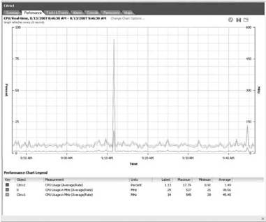
Figure 11.12 A Performance graph for a single virtual machine.
Hovering the mouse over the graph at a particular recorded interval of interest displays the data points at that specific moment in time, as shown in Figure 11.13.
Another nice feature of the graphs is the ability to emphasize a specific object so that it is easier to pick out this object from the other objects. By clicking the specific key at the bottom, the key and its color representing a specific object will be emphasized while the other keys and their respective colors become lighter and less visible, as shown in Figure 11.14.
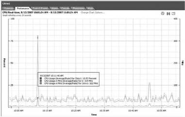
Figure 11.13 Hovering the mouse over a specific data point on the graph will display specific measurements for that particular point in time.
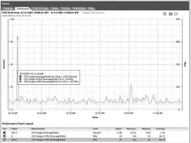
Figure 11.14 By clicking on a specific key in the Performance Chart Legend, that key will be emphasized while the other keys become less visible.
If the current graph does not reveal the data you were looking to find, click Change Chart Options at the top of the Performance chart to open a dialog box, shown in Figure 11.15, which lets you select from among many counters across the various physical hardware components.
On the left, you can choose which resource (CPU, Disk, Memory, Network, or System) to monitor or analyze. By selecting one of these options, you then have a choice of intervals to look at. Real-time will show you what has occurred in the last hour. The others are self-explanatory. For trend analysis, having all of these interval options allows you to choose exactly which interval you need. If these intervals are still not precise enough, you can create a custom interval c by selecting the Custom option under any of the available Chart Options, as shown in Figure 11.16.
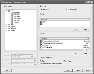
Figure 11.15 The Customize Performance Chart dialog box has many options.
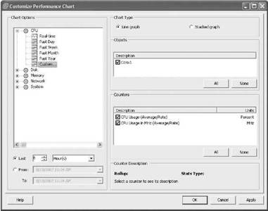
Figure 11.16 Setting a custom interval is easy. Here, the user only wants to look at the last six hours of data.
Many times, you want to look at what is happening now or what happened in the last hour for a host or a virtual machine. The Real-time interval gives the best view. This view also gives you access to certain counters for each resource type for a given host or virtual machine that are not available in the other views. If a particular counter is new to you, click on it to highlight the counter. At the bottom of the dialog box, in a section called Rollup, you'll see a description of the counter. For a host, the objects that can be monitored are the host as a whole and the individual physical devices. For the host chart option CPU, the objects and counters breakdown is shown in Figure 11.17.
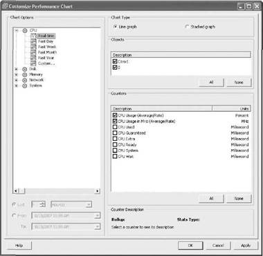
Figure 11.17 A host's CPU objects and counters.
Viewing Objects and Counters
To get a clear view of all the objects and counters in the Customize Performance Chart dialog box, you have to stretch the dialog box at the top or the bottom to lengthen it. This makes all of the counters visible. Sadly, there is no way to increase the length of the Objects section to see all of them, so scrolling is necessary.
For a host chart option Disk, the objects and counters are shown in Figure 11.18. The devices being monitored reflect the vmhba paths used by the VMkernel to access the disks associated with the virtual machine. Remember that the vmhba paths that are defined can use any of three types of controllers: a local SCSI controller, a fibre channel, or an iSCSI controller (if the controller is based on the iSCSI software initiator, the device name will be vmhba32).
No NAS Monitoring Objects
NAS cannot be monitored because the connection to NAS is not local SCSI, fibre channel, or iSCSI. Even if the ESX Server is configured to use NAS, that storage medium has no object listing or counters since all of the counters seem to be based on block storage only.
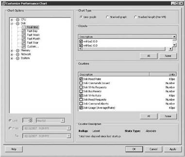
Figure 11.18 A host's Disk objects and counters.
For a host chart option Memory, the objects and counters are shown in Figure 11.19. In this case, there is only one object, the host itself.
For a host chart option of Network, shown in Figure 11.20, notice the objects are the host itself and any vmnic devices used by the VMkernel. If you have a particular virtual switch you want to monitor, find out which vmnic(s) are associated with that vSwitch by switching your view in the VI Client to the Configuration tab of the ESX host and then selecting Networking in the Hardware section.
For a host chart option System, the objects and counters are shown in Figure 11.21. There are several objects for the host with this chart option. This allows the administrator to see how many physical CPU cycles are being consumed by certain processes like vmware-authd or drivers. Be aware that many of the objects may not have any data associated with them.
For a virtual machine, the objects that can be monitored are the virtual machine as a whole and the individual virtual devices. For a virtual machine chart option CPU, the objects and counters breakdown is shown in Figure 11.22. Notice that the virtual device is the virtual processor 0, not the physical processor 0. If the virtual machine was configured with more than one processor, they would increment by one — 0, 1, 2, 3, etc.
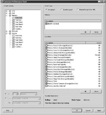
Figure 11.19 A host's Memory objects and counters.
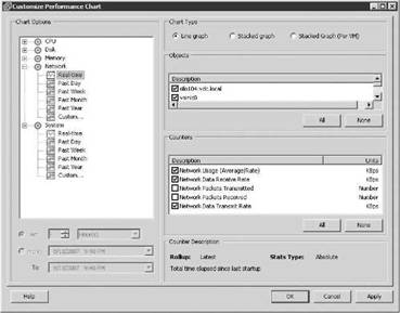
Figure 11.20 A host's Network objects and counters.
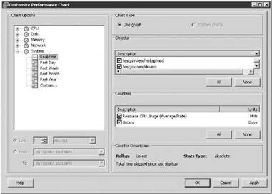
Figure 11.21 A host's System objects and counters.
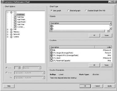
Figure 11.22 A virtual machine's CPU objects and counters.
For a virtual machine chart option Disk, the objects and counters breakdown is shown in Figure 11.23. Notice the virtual device is described as vmhba40:0:0, which corresponds to a VMk-ernel storage device, in this case, an iSCSI software initiator.
For a virtual machine chart option Memory, the objects and counters breakdown is shown in Figure 11.24. The only object is the virtual machine itself, but there are several counters.
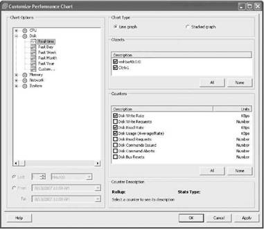
Figure 11.23 A virtual machine's Disk objects and counters.
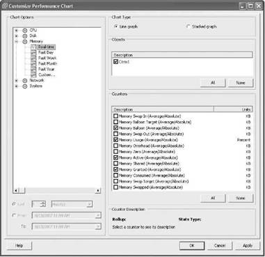
Figure 11.24 A virtual machine's Memory objects and counters.
For a virtual machine chart option Network, the objects and counters breakdown is shown in Figure 11.25. Notice that the virtual network device is described as 4000. If the virtual machine had two or more network adapters, they would be incremented by one for each — for example, 4001, 4002, 4003, 4004.
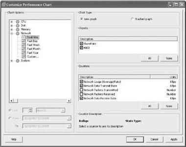
Figure 11.25 A virtual machine's Network objects and counters.
For a virtual machine chart option System, the object is the virtual machine itself, with counters of Heartbeat and Uptime, as shown in Figure 11.26.
Once you have selected the options you need for your graph, click OK.
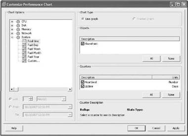
Figure 11.26 A virtual machine's System objects and counters.
Now that we are back to the graph, the Save icon in the top-right corner saves the graph into an Excel-formatted file. In the Time section of the Export Performance dialog box shown in Figure 11.27, choose the currently displayed interval or a different time frame.
Next, in the Chart Options section, select the type of graph to be saved: Line Graph or Stacked Graph. Figure 11.28 shows an example of a line graph.
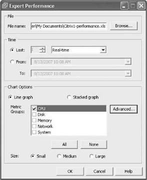
Figure 11.27 Saving a Performance graph. Be sure to select the interval and chart options you want. Also, you have a choice of the chart type and size.
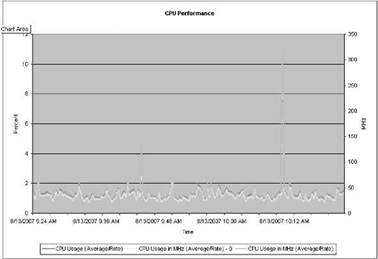
Figure 11.28 An example of the line graph for a virtual machine.
A stacked graph of the same data looks as shown in Figure 11.29.
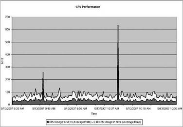
Figure 11.29 An example of a stacked graph for a virtual machine — same data, just a different view.
Stacked graphs are useful when looking at several virtual machines on the same host. When they are stacked on top of one another, it gives an aggregate usage, with colors to distinguish between them. This allows you to identify the busiest virtual machine or the one that represents the largest load on the server. Also, you can click the Advanced button to select or deselect specific counters to be saved as part of the Excel graph.
Here's another nice feature: click the Popup Chart icon to display the graph in a new window. This lets you easily compare this host or virtual machine with another host or virtual machine, as shown in Figure 11.30.
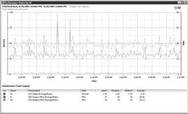
Figure 11.30 An example of the Popup Chart feature.
- Performance Graph Details and esxtop
- Chapter 11: Monitoring Virtual Infrastructure Performance
- Performance Profiler (Formerly ProfileScope)
- Configuring Apache for Peak Performance
- CHAPTER 31 Performance Tuning
- Real-Time Performance Measurement Tools
- 1.5.4. Performance
- Improving performance and fault tolerance with RAID
- 4.7.3 Performance
- Chapter 11 Monitoring Virtual Infrastructure Performance
- 8.2 Avoiding performance problems
- Lesson 1: Monitoring and Optimizing System Performance


