Книга: Beginning Android
Grid Your Lions (or Something Like That…)
Grid Your Lions (or Something Like That…)
As the name suggests, GridView gives you a two-dimensional grid of items to choose from. You have moderate control over the number and size of the columns; the number of rows is dynamically determined based on the number of items the supplied adapter says are available for viewing.
There are a few properties which, when combined, determine the number of columns and their sizes:
• android:numColumns spells out how many columns there are, or, if you supply a value of auto_fit, Android will compute the number of columns based on available space and the following properties.
• android:verticalSpacing and its counterpart android:horizontalSpacing indicate how much whitespace there should be between items in the grid.
• android:columnWidth indicates how many pixels wide each column should be.
• android:stretchMode indicates, for grids with auto_fit for android:numColumns, what should happen for any available space not taken up by columns or spacing — this should be columnWidth to have the columns take up available space or spacingWidth to have the whitespace between columns absorb extra space. For example, suppose the screen is 320 pixels wide, and we have android:columnWidth set to 100px and android:horizontalSpacing set to 5px. Three columns would use 310 pixels (three columns of 100 pixels and two whitespaces of 5 pixels). With android:stretchMode set to columnWidth, the three columns will each expand by 3–4 pixels to use up the remaining 10 pixels. With android:stretchMode set to spacingWidth, the two whitespaces will each grow by 5 pixels to consume the remaining 10 pixels.
Otherwise, the GridView works much like any other selection widget — use setAdapter() to provide the data and child views, invoke setOnItemSelectedListener() to register a selection listener, etc.
For example, here is a XML layout from the Selection/Grid sample project, showing a GridView configuration:
<?xml version="1.0" encoding="utf-8"?>

<LinearLayout

 xmlns:android="http://schemas.android.com/apk/res/android"

 android:orientation="vertical"

 android:layout_width="fill_parent"

 android:layout_height="fill_parent">

 <TextView

  android:id="@+id/selection"

  android:layout_width="fill_parent"

  android:layout_height="wrap_content"

 />

 <GridView

  android:id="@+id/grid"

  android:layout_width="fill_parent"

  android:layout_height="fill_parent"

  android:verticalSpacing="35px"

  android:horizontalSpacing="5px"

  android:numColumns="auto_fit"

  android:columnWidth="100px"

  android:stretchMode="columnWidth"

  android:gravity="center"

 />

</LinearLayout>
For this grid, we take up the entire screen except for what our selection label requires. The number of columns is computed by Android (android:numColumns="auto_fit") based on 5-pixel horizontal spacing (android:horizontalSpacing="5px"), 100-pixel columns (android:columnWidth="100px"), with the columns absorbing any “slop” width left over (android:stretchMode="columnWidth").
The Java code to configure the GridView is:
public class GridDemo extends Activity

 implements AdapterView.OnItemSelectedListener {

 TextView selection;

 String[] items={"lorem", "ipsum", "dolor", "sit", "amet",

  "consectetuer", "adipiscing", "elit", "morbi", "vel",

  "ligula", "vitae", "arcu", "aliquet", "mollis",

  "etiam", "vel", "erat", "placerat", "ante",

  "porttitor", "sodales", "pellentesque", "augue", "purus"};

 @Override

 public void onCreate(Bundle icicle) {

  super.onCreate(icicle);

  setContentView(R.layout.main);

  selection = (TextView)findViewById(R.id.selection);

  GridView g=(GridView)findViewById(R.id.grid);

  g.setAdapter(new FunnyLookingAdapter(this,

   android.R.layout.simple_list_item_1, items));

  g.setOnItemSelectedListener(this);

 }

 public void onItemSelected(AdapterView<?> parent, View v,

  int position, long id) {

  selection.setText(items[position]);

 }

 public void onNothingSelected(AdapterView<?> parent) {

  selection.setText("");

 }

 private class FunnyLookingAdapter extends ArrayAdapter {

  Context ctxt;

  FunnyLookingAdapter(Context ctxt, int resource,

   String[] items) {

   super(ctxt, resource, items);

   this.ctxt = ctxt;

  }

  public View getView(int position, View convertView,

   ViewGroup parent) {

   TextView label = (TextView)convertView;

   if (convertView==null) {

    convertView = new TextView(ctxt);

    label = (TextView)convertView;

   }

   label.setText(items[position]);

   return(convertView);

  }

 }

}
For the grid cells, rather than using auto-generated TextView widgets as in the previous sections, we create our own views, by subclassing ArrayAdapter and overriding getView(). In this case, we wrap the funny-looking strings in our own TextView widgets, just to be different. If getView() receives a TextView, we just reset its text; otherwise, we create a new TextView instance and populate it.
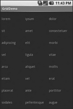
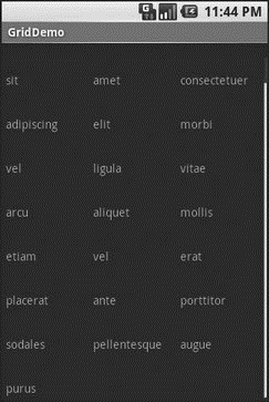
With the 35-pixel vertical spacing from the XML layout (android:verticalSpacing="35"), the grid overflows the boundaries of the emulator’s screen as shown in Figures 8-4 and 8-5.

Figure 8-4. The GridDemo sample application, as initially launched

Figure 8-5. The same application, scrolled to the bottom of the grid
- When Something Goes Wrong
- Chapter 12. Debugging your scripts
- Listing your active rule-set
- Updating and flushing your tables
- How to use this License for your documents
- 2. How to Apply These Terms to Your New Programs
- Data Binding Using the GridView Control
- Scaling makes your object darker?
- Partitioning Your Hard Drive
- Keeping Your Software Up-to-Date
- Assessing Your Backup Needs and Resources
- Building the Source Yourself


