Книга: Fedora™ Unleashed, 2008 edition
Working with OpenOffice.org Calc
Разделы на этой странице:
Working with OpenOffice.org Calc
The spreadsheet component of OpenOffice.org is named Calc, and is a very capable Excel alternative.
Calc is used for storing numeric information that you need to analyze in some way. So, for instance, you could use it to help you budget month by month. It can take care of the calculations for you, as long as you tell Calc what you want it to do. Anyone with experience in Excel will feel right at home with Calc.
In this section, we show you how to get started with Calc, including entering formulas and formatting. We also take a look at some of the more advanced features of Calc, including the Data Pilot feature, which allows you to easily summarize information.
Getting Started
You can either click the shortcut icon that is located on the top GNOME panel, or select Spreadsheet from the Office menu under the Applications main menu. Whichever route you take, the result is the same and Calc starts to load.
By default, Calc loads with a blank spreadsheet just waiting for you to enter information into it. In Figure 6.7, you can see that we have already started to enter some basic information into Calc.
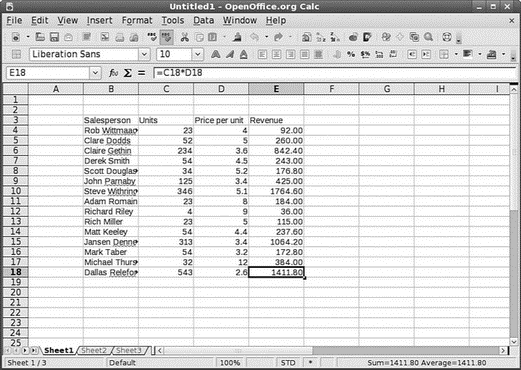
FIGURE 6.7 Use Calc to store numeric and statistical information.
Calc's layout makes it easy to organize information into rows and columns. As you can see in the example, we have salespeople listed in the left column, customers in the second column, invoice date in the third column, and finally revenue in the fourth column. At the moment, no formulas are entered to help you interpret the data. Clicking the E43 cell selects it and enables you to enter in a formula in the top formula bar. If you enter in the equal sign, Calc knows that you are entering a formula and works accordingly.
In this example, we want to know the total revenue brought in up to now, so the formula to enter is =sum(E4:E42), followed by Return. Calc automatically enters the result into cell E43 for you to see. Now you want to see what the average order value was. To do this, you have to obtain the number orders made. For this, you can use the counta function to count the number of entries in a given list. This is usually used when you need to find out how many entries there are in a text list. So, in cell B43, enter =counta(B4:B42) and press Enter. Calc now counts the number of entries in the range and returns the total in B43. All that remains for you to do is divide the total revenue by the number of orders to find the average order value. So, in cell E44, enter the formula =E43/B43 to get the average order value.
TIP
Calc offers some nifty little features that you can use quickly if you need to. The handiest one in our opinion is the capability to select multiple cells and see immediately the total and average of the range. You will find these figures in the bottom-right status bar. This has saved us numerous times when we have needed to get this information quickly!
Formatting Your Spreadsheets
Getting back to our example, it looks a little basic at the moment as there is no formatting involved. For instance, what's the billing currency? You can also see that some of the cells have text that does not fit, which is highlighted by a small right arrow in the cell. We should also add some labels and titles to our spreadsheet to make it a bit more visually appealing.
To start off, all the revenue figures can be changed into currency figures. To do this, select all the cells containing revenue information and click the small icon shown in Figure 6.8. This immediately formats the cells so that they display the dollar sign and also puts in a thousands separator to make the numbers easier to read.
Now you need to space all the cells so that you can read all the information. A quick and easy way to do this is to click the area immediately to the left of column A and immediately above row 1 to select the entire spreadsheet. Now all you have to do is double-click the dividing lines and each column resizes according to its longest entry.
Next you can add a little color to the worksheet by using the Paint Can icon in the toolbar. Select the range B3 to E3 with the mouse cursor and click the background fill icon to bring up the color window shown in Figure 6.9. Now select the color you want to use and Calc fills the cells with that color. You can also change the font color by using the icon immediately to the right in the same way.
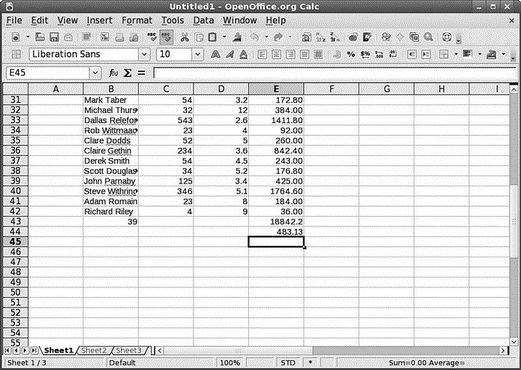
FIGURE 6.8 Make numbers more meaningful with the currency and percentage icons.
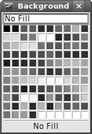
FIGURE 6.9 Add a touch of color to an otherwise dull spreadsheet with the Fill Background icon.
Finally, you need a couple more finishing touches. The first one is to enlarge the font for the column headers. Select the range B3 to E3 again and click the font size in the toolbar to change it to something a little larger. You might also want to use the bold and italic options to emphasize the headers and also the totals some more.
If you have followed the steps as described, you should end up with a spreadsheet similar to the one in Figure 6.10.
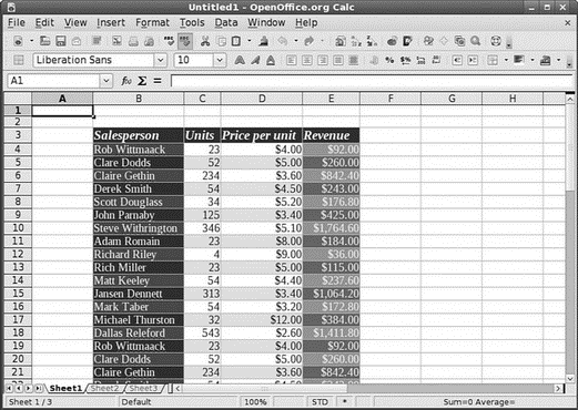
FIGURE 6.10 The finished article, looking a lot better than before!
Summarizing Data with Calc
Calc includes a powerful tool that lets you summarize large groups of data to help you when you need to carry out any analysis. This tool is called a Data Pilot, and you can use it to quickly summarize data that might normally take a long time if you did the calculations manually. Using the sample spreadsheet from earlier, we take you through how to build a simple Data Pilot, showing you how to analyze and manipulate long lists of data.
The previous section featured a spreadsheet that showed salespeople, customers, date of invoice, and revenue. At the foot of the spreadsheet were a couple of formulas that enabled you to quickly see the total revenue earned and the average order value.
Now you want to find out how much sales people have earned individually. Of course, you could add this up manually with a calculator, but that would defeat the point of using Calc. So, you need to create a Data Pilot to summarize the information.
First, you need to select all the cells from B3 to E42 as they contain the data you want to analyze. After these are selected, click the Data menu and select Data Pilot, Start to open the Data Pilot Wizard. The first screen is shown in Figure 6.11 and is defaulted to current selection. Make sure that you choose this one to use the data in the selected range and click OK to continue.

FIGURE 6.11 Use either the current selection or an external data source to provide the Data Pilot with information.
The next screen enables you to lay out your Data Pilot as you want it. In this example, you want to have Salesperson in the left column marked Row Fields, so click and drag the Salesperson option from the list on the right and drop it onto the Row Fields area. Next, drag out Revenue and drop it into the Data Fields area; it will automatically know to give you a sum of the revenue. We also want to know the average or mean price per unit, so drag Price per Unit onto the Data Fields area and double-click it. Select Average in the dialog box that appears and click OK. You should end up with something like Figure 6.12, and you are almost ready to display your Data Pilot.
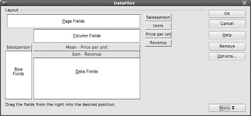
FIGURE 6.12 Lay out your Data Pilot as you want it.
The final piece in the puzzle is to tell Calc where you want it to place the finished Data Pilot. To do this, click the More button to drop down some extra options and then, to choose a new sheet, select the drop-down box next to Results To. When you click OK now, Calc builds the Data Pilot and displays it on a new sheet in your workbook. Figure 6.13 shows the new Data Pilot.
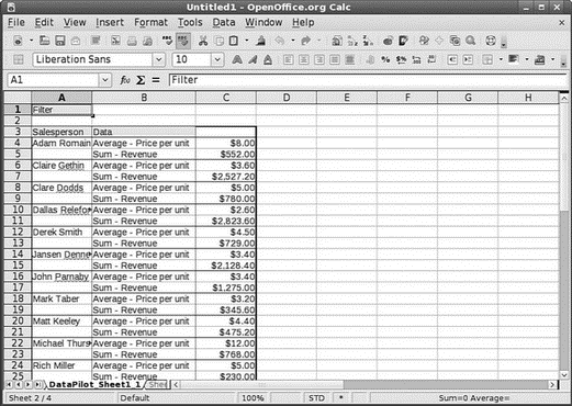
FIGURE 6.13 Summarize large volumes of numeric data with ease, using Calc's Data Pilot function.
- What Is in OpenOffice.org?
- Installing and Configuring OpenOffice.org
- SERVER WORKING SIZE
- Using Double Quotes to Resolve Variables in Strings with Embedded Spaces
- Drawbacks with restore
- 7. AGGREGATION WITH INDEPENDENT WORKS
- Конструкция with-do
- 3. Hexadecimal – the way we communicate with micros
- 4. How micros calculate
- CHAPTER 3 Working with GNOME
- CHAPTER 8 Printing with Fedora
- CHAPTER 14 Networking


