Книга: C# 2008 Programmer
Crafting XAML Using Expression Blend 2
Разделы на этой странице:
Crafting XAML Using Expression Blend 2
While you can code the UI by hand, an easier way is to use a designer tool to design and create the UI graphically.
Microsoft Expression Blend 2 is the professional design tool to create engaging web-connected experiences for Windows and Silverlight. Currently in version 2, you can download a 30-day trial edition of Expression Blend 2 from www.microsoft.com/downloads.
This section explains how to use Expression Blend 2 to build a Silverlight application and programmatically interact with the content of a Silverlight application using JavaScript.
Using Expression Blend 2
Launch Expression Blend 2 by selecting Start?Programs?Microsoft Expression?Microsoft Expression Blend 2. Create a new project by selecting the New Project item.
In the New Project dialog, select the Silverlight 1 Site project type and name the project RoundButton (see Figure 19-17). Click OK.
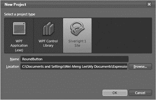
Figure 19-17
In the design view, double-click on the Canvas control to insert one onto the page (see Figure 19-18).
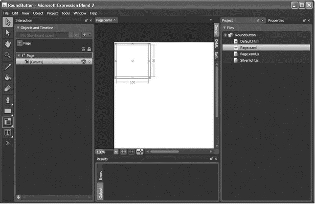
Figure 19-18
Right-click on the Rectangle control in the Toolbox, and select the Ellipse (see Figure 19-19).
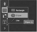
Figure 19-19
Double-click on the Ellipse element to add it to the page. Move the Ellipse object into the Canvas control by dragging it onto the Canvas object in the Objects and Timeline window (see Figure 19-20).
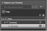
Figure 19-20
The page now looks like Figure 19-21.
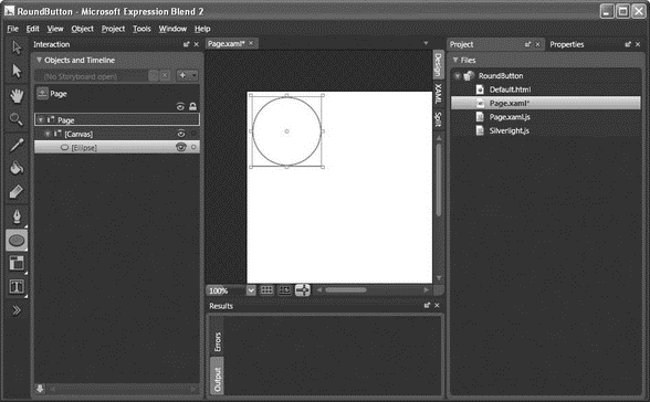
Figure 19-21
With the Ellipse object selected, select the Properties inspector, and click (see Figure 19-22):
? Stroke
? Solid Color Brush
? Specify 5 for StrokeThickness
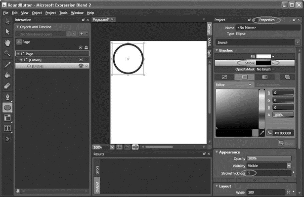
Figure 19-22
Next, click the following (see Figure 19-23):
? Fill
? Gradient Brush
? Specify 180 for B, 248 for G, 8 for B, and 100% for A
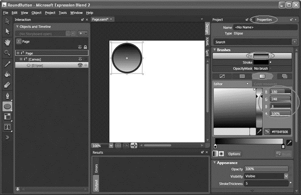
Figure 19-23
Click on the Brush Transform tool, and observe the arrow on the Ellipse element (see Figure 19-24).
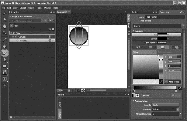
Figure 19-24
Move the arrow 135 degrees counterclockwise, as shown in Figure 19-25.

Figure 19-25
Make a copy of the Ellipse element (right-click on the Ellipse element in the Objects and Timeline window and select Copy, then paste it onto the page and move it into the Canvas control again).
For the new Ellipse control, gradient-fill it in the opposite direction by reversing the direction of the arrow (see Figure 19-26).
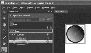
Figure 19-26
Select the Properties inspector, and set its properties as follows (see Figure 19-27):
| Property | Value |
|---|---|
Name |
EllipsePressed |
Opacity |
0% |
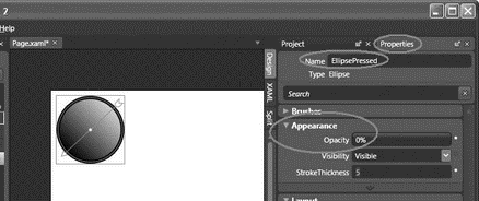
Figure 19-27
Double-click on the TextBlock element to add it to the page. As usual, move it into the Canvas control and type OK into the TextBlock element (see Figure 19-28).
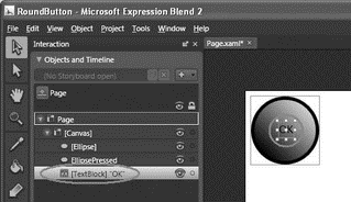
Figure 19-28
With the TextBlock object selected, select the Properties inspector, and click (see Figure 19-29):
? Foreground
? Solid Color Brush
? Specify 251 for B, 219 for G, 8 for B, and 100% for A
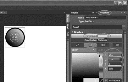
Figure 19-29
Set the TextBlock's font size to 18 and Bold (see Figure 19-30).
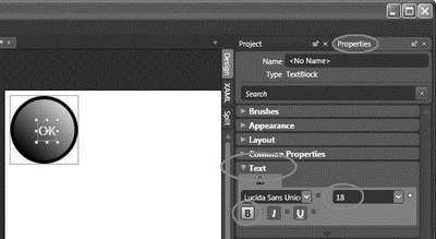
Figure 19-30
Control-click the following controls in the Objects and Timeline window and right-click on them and then select Group Into?Canvas (see Figure 19-31):
? Ellipse
? EllipsePressed
? TextBlock
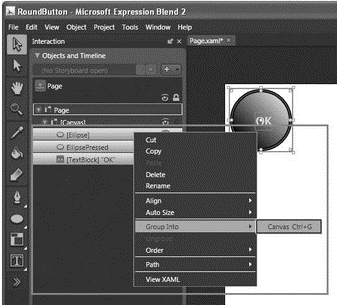
Figure 19-31
All the selected controls are now grouped into one. Name the new composite control RoundButton (see Figure 19-32).

Figure 19-32
Switch to the XAML view of the project (see Figure 19-33).
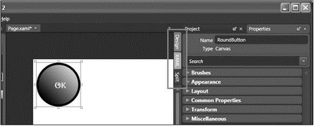
Figure 19-33
Scripting the UI Using JavaScript
Insert the following highlighted code into the RoundButton Canvas control:
<Canvas

 xmlns="http://schemas.microsoft.com/client/2007"

 xmlns:x="http://schemas.microsoft.com/winfx/2006/xaml"

 Width="640" Height="480"

 Background="White">

 <Canvas

  Width="100" Height="100"

  Canvas.Top="8" Canvas.Left="8">

  <Canvas

   Width="100" Height="100"

   MouseLeftButtonDown="ButtonClicked"

   MouseLeftButtonUp="ButtonReleased"

   MouseLeave="ButtonReleased">
In the Project window, double-click the Page.xaml.js file. Append the following block of code to the end of the file:
function ButtonClicked(sender, eventArgs) {

 if (sender.name == "RoundButton") {

  //---Get a reference to the ellipse---

  var pressedEllipse = sender.findName("EllipsePressed");

  pressedEllipse.opacity = 1;

 }

}

function ButtonReleased(sender, eventArgs) {

 if (sender.name == "RoundButton") {

  //---Get a reference to the ellipse---

  var pressedEllipse = sender.findName("EllipsePressed");

  pressedEllipse.opacity = 0;

 }

}
Finally, press F5 to test the application. Click the button and observe the effect (see Figure 19-34).
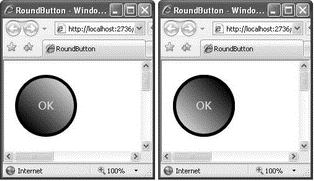
Figure 19-34
- Building a Silverlight UI Using XAML
- IP filtering terms and expressions
- What NAT is used for and basic terms and expressions
- Caveats using NAT
- Using Double Quotes to Resolve Variables in Strings with Embedded Spaces
- Data Binding Using the GridView Control
- Using the kill Command to Control Processes
- Installing Using a Network
- Using X
- Using a Display Manager
- Starting X from the Console by Using startx
- Using Fedora's switchdesk Client


