Книга: Beginning Android
LinearLayout Example
LinearLayout Example
Let’s look at an example (Containers/Linear) that shows LinearLayout properties set both in the XML layout file and at runtime.
<?xml version="1.0" encoding="utf-8"?>"
<LinearLayout
xmlns:android="http://schemas.android.com/apk/res/android
 android:orientation="vertical"

 android:layout_width="fill_parent"

 android:layout_height="fill_parent">

 <RadioGroup android:id="@+id/orientation"

  android:orientation="horizontal"

  android:layout_width="wrap_content"

  android:layout_height="wrap_content"

  android:padding="5px">

  <RadioButton

   android:id="@+id/horizontal"

   android:text="horizontal" />

  <RadioButton

   android:id="@+id/vertical"

   android:text="vertical" />

 </RadioGroup>

 <RadioGroup android:id="@+id/gravity"

  android:orientation="vertical"

  android:layout_width="fill_parent"

  android:layout_height="wrap_content"

  android:padding="5px">

  <RadioButton

   android:id="@+id/left"

   android:text="left" />

  <RadioButton

   android:id="@+id/center"

   android:text="center />

  <RadioButton

   android:id="@+id/right"

   android:text="right" />

 </RadioGroup>

</LinearLayout>
Note that we have a LinearLayout wrapping two RadioGroup sets. RadioGroup is a subclass of LinearLayout, so our example demonstrates nested boxes as if they were all LinearLayout containers.
The top RadioGroup sets up a row (android:orientation="horizontal") of RadioButton widgets. The RadioGroup has 5px of padding on all sides, separating it from the other RadioGroup. The width and height are both set to wrap_content, so the radio buttons will take up only the space that they need.
The bottom RadioGroup is a column (android:orientation="vertical") of three RadioButton widgets. Again, we have 5px of padding on all sides and a “natural” height (android:layout_height="wrap_content"). However, we have set android:layout_width to be fill_parent, meaning the column of radio buttons “claims” the entire width of the screen.
To adjust these settings at runtime based on user input, we need some Java code:
package com.commonsware.android.containers;

import android.app.Activity;

import android.os.Bundle;

import android.view.Gravity;

import android.text.TextWatcher;

import android.widget.LinearLayout;

import android.widget.RadioGroup;

import android.widget.EditText;

public class LinearLayoutDemo extends Activity

 implements RadioGroup.OnCheckedChangeListener {

 RadioGroup orientation;

 RadioGroup gravity;

 @Override

 public void onCreate(Bundle icicle) {

  super.onCreate(icicle);

  setContentView(R.layout.main);

  orientation=(RadioGroup)findViewById(R.id.orientation);

  orientation.setOnCheckedChangeListener(this);

  gravity=(RadioGroup)findViewById(R.id.gravity);

  gravity.setOnCheckedChangeListener(this);

 }

 public void onCheckedChanged(RadioGroup group, int checkedId) {

  if (group==orientation) {

   if (checkedId==R.id.horizontal) {

    orientation.setOrientation(LinearLayout.HORIZONTAL);

   } else {

    orientation.setOrientation(LinearLayout.VERTICAL);

   }

  } else if (group==gravity) {

   if (checkedId==R.id.left) {

    gravity.setGravity(Gravity.LEFT);

   } else if (checkedId==R.id.center) {

    gravity.setGravity(Gravity.CENTER_HORIZONTAL);

   } else if (checkedId==R.id.right) {

    gravity.setGravity(Gravity.RIGHT);

   }

  }

 }

}
In onCreate(), we look up our two RadioGroup containers and register a listener on each, so we are notified when the radio buttons change state (setOnCheckedChangeListener(this)). Since the activity implements OnCheckedChangeListener, the activity itself is the listener.
In onCheckedChanged() (the callback for the listener), we see which RadioGroup had a state change. If it was the orientation group, we adjust the orientation based on the user’s selection. If it was the gravity group, we adjust the gravity based on the user’s selection.
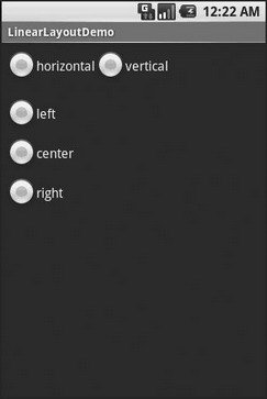
Figure 7-2 shows the result when the sample application is first launched inside the emulator.

Figure 7-2. The LinearLayoutDemo sample application, as initially launched
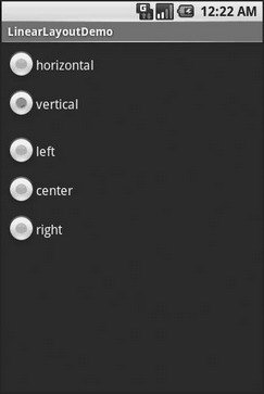
If we toggle on the Vertical radio button, the top RadioGroup adjusts to match (see Figure 7-3).

Figure 7-3. The same application, with the Vertical radio button selected
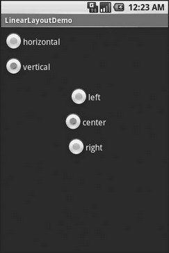
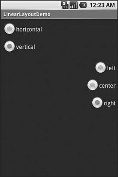
If we toggle the Center or Right radio button, the bottom RadioGroup adjusts to match (see Figures 7-4 and 7-5).

Figure 7-4. The same application, with the Vertical and Center radio buttons selected

Figure 7-5. The same application, with the Vertical and Right radio buttons selected
- Chapter 14. Example scripts
- Appendix J. Example scripts code-base
- Example NAT machine in theory
- example rc.firewall
- Example rc.firewall script
- Example rc.DMZ.firewall script
- Example rc.UTIN.firewall script
- Example rc.DHCP.firewall script
- Example rc.flush-iptables script
- Example rc.test-iptables script
- An Example of Conversions in Action
- 6.3.2. Example Web Server Startup Script


