Книга: C# 2008 Programmer
Understanding XAML
Разделы на этой странице:
Understanding XAML
In this section, you see how to create the user interface of a Silverlight application using the Extensible Application Markup Language (XAML).
Using Notepad, create the following XAML file; name it UI.xaml and save it in C:Silverlight.
<Canvas

 xmlns="http://schemas.microsoft.com/client/2007"

 xmlns:x="http://schemas.microsoft.com/winfx/2006/xaml">

 <Ellipse

  Height="200" Width="200"

  Stroke="Black"

  StrokeThickness="10"

  Fill="Yellow"/>

 <Rectangle

  Canvas.Left="80"

  Canvas.Top="80"

  Height="200"

  Width="200"

  Stroke="Black"

  StrokeThickness="10"

  Fill="LightBlue"/>

</Canvas>
Double-click on Default.html now to load it in the web browser. Figure 19-4 shows the output.
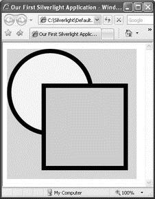
Figure 19-4
This XAML file contains two elements, <Ellipse> and <Rectangle>, which display an ellipse and a rectangle, respectively, on the page. Both elements are embedded within a Canvas control.
The Canvas Control
The Canvas control (every Silverlight application has at least one Canvas control) is designed to contain and position other controls and elements.
To define the positioning of controls within the Canvas control, you use the Canvas.Left and Canvas.Top attributes. The z order of objects embedded within a Canvas object is determined by the sequence in which they are declared. As the previous section shows, the <Rectangle> element is defined after the <Ellipse> element, and hence it overlaps the <Ellipse> element. However, you can override this default ordering by specifying the ZIndex attribute, as the following example shows.
Edit the UI.xaml file created in the previous section, and add the Canvas.ZIndex attribute for both the <Ellipse> and <Rectangle> elements:
<Canvas

 xmlns="http://schemas.microsoft.com/client/2007"

 xmlns:x="http://schemas.microsoft.com/winfx/2006/xaml">

 <Ellipse

  Canvas.ZIndex="2"

  Height="200" Width="200"

  Stroke="Black"

  StrokeThickness="10"

  Fill="Yellow"/>

 <Rectangle

  Canvas.ZIndex="1"

  Canvas.Left="80"

  Canvas.Top="80"

  Height="200" Width="200"

  Stroke="Black"

  StrokeThickness="10"

  Fill="LightBlue"/>

</Canvas>
Reload the Default.html file in the web browser, and notice that the ellipse is now on top of the rectangle (see Figure 19-5).
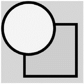
Figure 19-5
You can also nest Canvas controls within one another. Edit the UI.xaml file created earlier and replace its content with the following:
<Canvas

 xmlns="http://schemas.microsoft.com/client/2007"

 xmlns:x="http://schemas.microsoft.com/winfx/2006/xaml">

 <Canvas

  Canvas.Left="80" Canvas.Top="80"

  Height="250" Width="250"

  Background="lightgreen">

  <Ellipse

   Canvas.ZIndex="2"

   Canvas.Left="10" Canvas.Top="10"

   Height="200" Width="200"

   Stroke="Black"

   StrokeThickness="10"

   Fill="Yellow"/>

 </Canvas>

</Canvas>
Reload the Default.html file in the web browser, and observe the changes (see Figure 19-6).
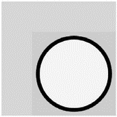
Figure 19-6
The positions specified by the Canvas.Left and Canvas.Topattributes of each element or control are relative to its parent control, and not the root control.
Drawing Shapes
One of the key capabilities of Silverlight is the support for drawing objects of different shapes and sizes. Silverlight provides the following basic shape elements:
? Rectangle
? Ellipse
? Line
? Polygon
? Polyline
Rectangle
A <Rectangle> element draws a rectangle (or square) with optional rounded corners. To specify rounded corners, use the RadiusX and RadiusY attributes. Edit the UI.xaml file created in the previous section and replace its content with the following:
<Canvas

 xmlns="http://schemas.microsoft.com/client/2007"

 xmlns:x="http://schemas.microsoft.com/winfx/2006/xaml">

 <Rectangle

  Canvas.Left="10" Canvas.Top="10"

  Height="100" Width="200"

  Stroke="Black"

  StrokeThickness="10"

  Fill="Yellow"

  RadiusX="10"

  RadiusY="10"/>

 <Rectangle

  Canvas.Left="60" Canvas.Top="60"

  Height="200" Width="180"

  Stroke="Black"

  StrokeThickness="10"

  Fill="LightBlue"

  RadiusX="30"

  RadiusY="30"/>

</Canvas>
Reload Default.html in the web browser. Figure 19-7 shows the output.
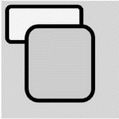
Figure 19-7
Line
A <Line> element draws a line on the Canvas control. Edit the UI.xaml file created in the previous section and replace its content with the following:
<Canvas

 xmlns="http://schemas.microsoft.com/client/2007"

 xmlns:x="http://schemas.microsoft.com/winfx/2006/xaml">

 <Line X1="10" Y1="10" X2="100" Y2="180"

  Stroke="black" StrokeThickness="5"/>

 <Line X1="100" Y1="10" X2="10" Y2="180"

  Stroke="red" StrokeThickness="10"/>

</Canvas>
Reload the Default.html file in the web browser, and observe the output (see Figure 19-8).

Figure 19-8
Ellipse
An <Ellipse> element draws a circle (or oval) on the Canvas control. Edit the UI.xaml file created in the previous section, and replace its content with the following:
<Canvas

 xmlns="http://schemas.microsoft.com/client/2007"

 xmlns:x="http://schemas.microsoft.com/winfx/2006/xaml">

 <Ellipse

  Canvas.Left="30" Canvas.Top="30" Height="60" Width="60"

  Stroke="Black" StrokeThickness="10" Fill="Pink"/>

 <Ellipse

  Canvas.Left="200" Canvas.Top="30" Height="60" Width="60"

  Stroke="Black" StrokeThickness="10" Fill="LightBlue"/>

 <Ellipse

  Canvas.Left="20" Canvas.Top="100" Height="70" Width="250"

 Stroke="Black" StrokeThickness="10" Fill="LightGreen"/>

</Canvas>
Reload Default.html in the web browser. Figure 19-9 shows the output.
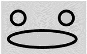
Figure 19-9
Polygon
A <Polygon> element draws a shape with arbitrary number of sides. Edit UI.xaml again, replacing its content with the following:
<Canvas

 xmlns="http://schemas.microsoft.com/client/2007"

 xmlns:x="http://schemas.microsoft.com/winfx/2006/xaml">

 <Polygon Points="100,10 10,160 190,160"

  Stroke="Yellow" StrokeThickness="5" Fill="Red"/>

</Canvas>
Reload Default.html in the web browser to see the result (see Figure 19-10).

Figure 19-10
Polyline
A <Polyline> element draws a series of connected lines. Edit the UI.xaml file and replace its content with the following:
<Canvas

 xmlns="http://schemas.microsoft.com/client/2007"

 xmlns:x="http://schemas.microsoft.com/winfx/2006/xaml">

 <Polyline Points="100,10 10,160 210,160 120,10"

  Stroke="Black" StrokeThickness="8"/>

</Canvas>
Reload Default.html in the web browser, and observe the output (see Figure 19-11).

Figure 19-11
Painting Shapes
The Fill attribute that you have seen in many of the previous examples fills (paints) a shape with a solid color. However, the fill is not restricted to solid colors. Silverlight supports various ways to paint a shape:
? SolidColorBrush
? LinearGradientBrush
? RadialGradientBrush
? ImageBrush
Using SolidColorBrush
The <SolidColorBrush> element paints an area with a solid color. Edit the UI.xaml file created in the previous section, and replace its content with the following:
<Canvas

 xmlns="http://schemas.microsoft.com/client/2007"

 xmlns:x="http://schemas.microsoft.com/winfx/2006/xaml">

 <Ellipse

  Canvas.Left="10" Canvas.Top="10"

  Height="100" Width="100"

  Stroke="Black" StrokeThickness="10" Fill="Yellow"/>

 <Ellipse

  Canvas.Left="120" Canvas.Top="10"

  Height="100" Width="100"

  Stroke="Black" StrokeThickness="10"

  Fill="#A3FC96"/> <!-- 6-digit hexadecimal -->

 <Ellipse

  Canvas.Left="10" Canvas.Top="120"

  Height="100" Width="100"

  Stroke="Black" StrokeThickness="10"

  Fill="#A3FC96FF"/>

 <!-- 6-digit hexadecimal + 2-digit for alpha/opacity value -->

 <Ellipse

  Canvas.Left="120" Canvas.Top="120"

  Height="100" Width="100"

  Stroke="Black" StrokeThickness="10">

  <Ellipse.Fill>

   <SolidColorBrush Color="LightBlue"/>

  </Ellipse.Fill>

 </Ellipse>

</Canvas>
In this example, the Fill attribute specifies the solid color to use to fill up the particular element. Reload the Default.html file in the web browser, and observe the output in your browser (see Figure 19-12).
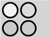
Figure 19-12
Using LinearGradientBrush
The LinearGradientBrush element paints an area with a linear gradient. Edit the UI.xaml file again, replacing its content with the following:
<Canvas

 xmlns=http://schemas.microsoft.com/client/2007

 xmlns:x="http://schemas.microsoft.com/winfx/2006/xaml">

 <Ellipse

  Canvas.Left="10" Canvas.Top="10"

  Height="100" Width="100"

  Stroke="Black" StrokeThickness="10">

  <Ellipse.Fill>

   <LinearGradientBrush>

    <!-- fill is diagonal by default -->

    <GradientStop Color="Yellow" Offset="0.25"/>

    <GradientStop Color="Red" Offset="0.5"/>

    <GradientStop Color="Blue" Offset="0.75"/>

   </LinearGradientBrush>

  </Ellipse.Fill>

 </Ellipse>

 <Ellipse

  Canvas.Left="120" Canvas.Top="10"

  Height="100" Width="100"

  Stroke="Black" StrokeThickness="10">

  <Ellipse.Fill>

   <!-- fill is horizontal -->

   <LinearGradientBrush StartPoint="0,0" EndPoint="1,0">

    <GradientStop Color="Yellow" Offset="0.25"/>

    <GradientStop Color="Red" Offset="0.5"/>

    <GradientStop Color="Blue" Offset="0.75"/>

   </LinearGradientBrush>

  </Ellipse.Fill>

 </Ellipse>

</Canvas>
Here you used the <Ellipse.Fill> element to fill the each ellipse shapes with a <LinearGradientBrush> element. Reload the Default.html file in the web browser. Figure 19-13 shows the output.

Figure 19-13
Using RadialGradientBrush
The <RadialGradientBrush> element paints an area with a radial gradient. Edit the UI.xaml file, and replace its content with the following:
<Canvas

 xmlns="http://schemas.microsoft.com/client/2007"

 xmlns:x="http://schemas.microsoft.com/winfx/2006/xaml">

 <Ellipse

  Canvas.Left="10" Canvas.Top="10"

  Height="100" Width="100"

  Stroke="Black" StrokeThickness="10">

  <Ellipse.Fill>

   <RadialGradientBrush>

    <GradientStop Color="Yellow" Offset="0.25"/>

    <GradientStop Color="Red" Offset="0.5"/>

    <GradientStop Color="Blue" Offset="0.75"/>

   </RadialGradientBrush>

  </Ellipse.Fill>

 </Ellipse>

 <Ellipse

  Canvas.Left="120" Canvas.Top="10"

  Height="100" Width="100"

  Stroke="Black" StrokeThickness="10">

  <Ellipse.Fill>

   <RadialGradientBrush GradientOrigin="0.5,0">

    <GradientStop Color="Yellow" Offset="0.25"/>

    <GradientStop Color="Red" Offset="0.5"/>

    <GradientStop Color="Blue" Offset="0.75"/>

   </RadialGradientBrush>

  </Ellipse.Fill>

 </Ellipse>

</Canvas>
Reload the Default.html file in the web browser, and observe the output (see Figure 19-14).

Figure 19-14
Using ImageBrush
The <ImageBrush> element paints an area with an image. Assuming that you have the image shown in Figure 19-15 saved as C:SilverlightUSFlag.jpg, edit the UI.xaml file created, and replace its content with the following:

Figure 19-15
<Canvas

 xmlns="http://schemas.microsoft.com/client/2007"

 xmlns:x="http://schemas.microsoft.com/winfx/2006/xaml">

 <Ellipse

  Canvas.Left="10" Canvas.Top="10"

  Height="100" Width="100"

  Stroke="Black" StrokeThickness="10">

  <Ellipse.Fill>

   <ImageBrush ImageSource="USFlag.jpg"/>

  </Ellipse.Fill>

 </Ellipse>

 <Ellipse

  Canvas.Left="120" Canvas.Top="10"

  Height="100" Width="100"

  Stroke="Black" StrokeThickness="10">

  <Ellipse.Fill>

   <ImageBrush ImageSource="USFlag.jpg" Stretch="Uniform"/>

  </Ellipse.Fill>

 </Ellipse>

</Canvas>
Reload Default.html in the web browser to view the output (see Figure 19-16).

Figure 19-16
- Building a Silverlight UI Using XAML
- Understanding the Command Line
- Understanding Set User ID and Set Group ID Permissions
- Understanding init Scripts and the Final Stage of Initialization
- Understanding Point-to-Point Protocol over Ethernet
- Understanding SQL Basics
- Understanding the Changes Made by DHCP
- Understanding Computer Attacks
- Understanding SELinux
- Understanding the ext3 File System Structure
- Understanding drive status
- Understanding encryption and the encrypting file system


